 |
 |
BMW Garage | BMW Meets | Register | Today's Posts | Search |
| 01-05-2016, 02:33 PM | #24 |
|
Lieutenant
   
306
Rep 442
Posts
Drives: 2016 F82 M4 AW/SO
Join Date: Sep 2015
Location: West Des Moines, IA
|
Am I the only one who doesn't care for BMW's non-M or M-sport steering wheel?
__________________
2016 F82 M4 / AW/SO - Current
2013 E92 M3 ZCP / SG/FR - Sold 2008 E92 M3 / AW/FR - RIP 2008 335xi Coupe / JB/CR - Sold |
|
Appreciate
0
|
| 01-05-2016, 02:36 PM | #25 |
|
Brigadier General
 
11803
Rep 4,870
Posts |
Pretty much a tie. Maybe slight edge to BMW for not needing to worry about nav screen open / close breaking at some point.
__________________
Current: 2018 SO/SS F83 ZCP
Gone: 2015 SO/SO F82 |
|
Appreciate
0
|
| 01-05-2016, 02:42 PM | #26 |
|
Self-Deprecating Narcissist

7307
Rep 6,561
Posts |
very cool feature:
[u2b] [/u2b] i had the opportunity to get in the new Q7 for a day and the win for being more intuitive and tech advanced goes to audi but i think for design and layout the win goes to bmw. one thing i hated about bmw since the inception of idrive is that many common features or menus are buried in sub-folders or groupings. even if you do shortcut keys some menus cannot be stored but on the audi you can have one or two touch even voice shortcuts to take you right to the menu.
__________________
|
|
Appreciate
0
|
| 01-05-2016, 02:52 PM | #28 |
|
Private First Class
 
116
Rep 140
Posts
Drives: '16 M3 (en route)
Join Date: Jun 2015
Location: Phoenix, Az
|
It doubles as a laptop mount.
Not feeling the Audi at all, why does it look like the A/C vents extend all the way across in front of the passenger?
__________________
- Michael
2016 BMW M3 (stock) 2005 Jeep LJ (slightly modified) |
|
Appreciate
0
|
| 01-05-2016, 04:01 PM | #29 |
|
Self-Deprecating Narcissist

7307
Rep 6,561
Posts |
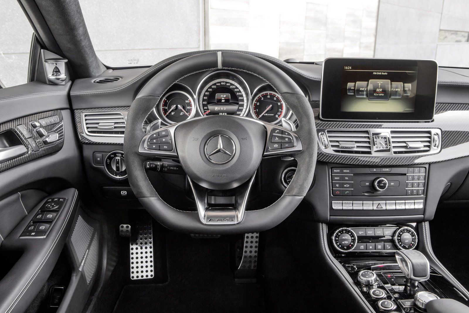
the colorway doesn't do it any justice but it's a nice layout minus the MB style shift knob...
  the e63 interior has way too many buttons as well but the platform is old as hell despite two face lifts. because it does... detailing nightmare that reminds me of early 80's GM interiors... i hate that a lot of new cars are coming with the front quarter window gm implemented back in the day as well.
__________________
|
|
Appreciate
1
|
| 01-06-2016, 12:37 AM | #30 | |
|
bimmerphile, technogeek

1005
Rep 3,795
Posts
Drives: 2012 E82 6MT Sport
Join Date: Jun 2011
Location: SoCal
|
Quote:
The E30 and E36 interiors were clean and simple... And driver-oriented.
__________________
 |
|
|
Appreciate
0
|
| 01-06-2016, 09:51 AM | #31 |
|
Lieutenant Colonel
 
527
Rep 1,503
Posts |
I want the new Audi TT dash. I absolutely love it.
Love the quilted seats Love the gauges and display Love that the buttons are inside the vents I think Audi does some nice interiors. BMW is awesomely utilitarian. BTW I loved the driver centric E36 cabin in my M3
__________________
miiipilot
'24 M2 Brooklyn Grey, 6mt, Bi-Color, Black M-Color seats, '16 MG M2, DCT, Exec. Took Delivery 4/30/16 (Sold) |
|
Appreciate
0
|
| 01-06-2016, 03:55 PM | #33 |
|
Second Lieutenant
 
45
Rep 271
Posts |
The instrument cluster on the Audi looks way cooler than the one on the BMW, hands down. On the other hand, I guess it might be a bit distracting for some.
I would probably find myself staring too much at the cluster while driving, which wouldn't be safe.  Also, the image of the BMW should show the newer dynamic digital instrument cluster: http://f10.5post.com/forums/showthread.php?t=760549 And Mercedes....I had an MB for a test run (before I got my X4) and I thought: What in the h*** were those MB designers thinking of when they decided to put a low resolution, badly designed, iPad-ish thingy in the middle of the dashboard - with two inches of black edges around it!? They couldn't even agree about the iDrive(equivalent) control. - Should we do a touchpad á la Android or an iDrive knob á la BMW? Crap, let's do both!  |
|
Appreciate
0
|
| 01-06-2016, 06:49 PM | #34 |
|
Colonel
 
5902
Rep 2,010
Posts |
|
|
Appreciate
0
|
| 01-10-2016, 09:09 PM | #36 |
|
Self-Deprecating Narcissist

7307
Rep 6,561
Posts |
it is large and i am not sure what the point of such a large shifter may be but it reminds me of some of the mb shift knobs and older bmw...
  
__________________
|
|
Appreciate
0
|
| 01-10-2016, 09:22 PM | #37 |
|
Colonel
 
923
Rep 2,710
Posts
Drives: MB E350 4MATIC Estate
Join Date: Feb 2012
Location: Sherman Oaks, CA
|
I never appreciated how driver-centric my dash is until I rode in the passenger seat once. Everything is canted towards the driver! Ergonomically, I think it's perfect.
|
|
Appreciate
0
|
| 01-12-2016, 11:10 PM | #39 |
|
Colonel
 
1755
Rep 2,162
Posts |
Those infotainment screens are just horrible. I wish I could have ordered my car without all of that crap. For me all of that tech is really useless.
So I vote BMW steering wheel, Audi interior. Rip out the screen on both. Fix the continuous vent look on Audi. Did I mention the infotainment screams make me    : : :fighting0 030: :fighting0 030:
__________________
2016 F80 | MG/SO | DCT | Adaptive M Suspension | 19" Black 437M Wheels | CF Roof | CF Trim
|
|
Appreciate
0
|
Post Reply |
| Bookmarks |
|
|